Some days the social internet makes up for all its corrosive effects by gifting you something inspiring…that turns into something wonderful.
Just this afternoon thanks to a Robinson Meyer tweet I was introduced to the poem Janus: Sonnet by one John M. Ford. Sonnets by themselves are hard to do well, but this is one of those poems that turns the genius level up to eleven. Not only does Ford weave some subtle and vivid truth into the standard sonnet form (an intricate job by itself), but he builds in an additional device that, when you see it, will astonish you.
If you understand what “Janus” refers to, you should be able to teach yourself how to read the sonnet. When you find Ford’s trick, you will understand the poem.
But it gets more interesting. Because Graham Sleight responded with another example of Ford’s genius: another smashing sonnet that he left as a comment on someone’s blog — !?! A later commenter notes, “This is, after all, the man who won a World Fantasy Award for a poem he wrote for his own self-published Christmas card.” (He has one several such awards, though I haven’t been able to figure out which one was being referenced here.)
Here, then, it seems we have a kind of Banksy of poetry, leaving little threads and tuns of treasure everywhere, not just in print but all throughout these quiet old places on the web that have just been sitting there for ten or fifteen or twenty years now.
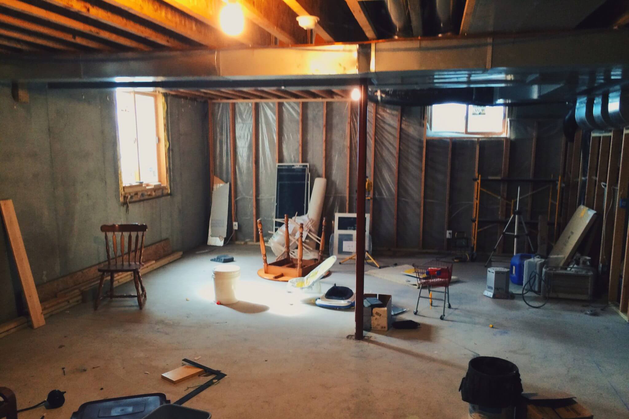
We were just approved for a building permit to finish off our basement. When done, we’ll have a rec room, another bathroom and another (rather large) bedroom down there, which will be useful for guests.
Here it is in its current, unfinished state:
The unfinished basement
This is some poor photography but it allows you to see a few of the project’s distinguishing features.
The ducts for the forced air heating/cooling system had to run underneath the first floor system. This means I’ll need to build soffits around them, lowering the ceiling under those ducts. In addition, though, a couple of my walls are located under those ducts, which means I won’t be able to fasten the tops of those walls to the joists. I’ll have to find some other way to brace those walls so that they don’t wobble at the top, which might be tricky because they’re also the shortest walls and they don’t have much to grab onto to begin with.
You can see that I had put a plastic vapour barrier behind the outside wall framing, but I won’t be doing that for the rest of the outside walls, because there’s no legal requirement (and really no need) for it. The foundation walls are 8″ poured concrete, with a moisture barrier on the outside. If the foundation walls had been cement block, which is hollow and quite porous, I’d have been required to put plastic between the foundation and the wood walls to protect them from any water that might weep through from the outside.
I’m also not planning to put any insulation on the outside walls. This tends to raise some eyebrows. The foundation walls also have a small amount of insulation (R–5) on the outside, which, combined with the R–40+ insulation in the attic, gives me all the insulation I need (again both legally and practically). Furthermore, if I were to add insulation to the inside, I’d be effectively preventing the house’s warmth from penetrating the concrete wall, making the wall itself colder.
We’re hoping to have most of this project (except for the bathroom) complete by Christmas time so visiting kin can make use of it. That might be tough with the baby due in a month but we have a shot at it.
The web, as it appears at any one moment, is a phantasmagoria. It’s not a place in any reliable sense of the word. It is not a repository. It is not a library. It is a constantly changing patchwork of perpetual nowness.
You can’t count on the web, okay? It’s unstable. You have to know this.
…If a sprawling Pulitzer Prize-nominated feature in one of the nation’s oldest newspapers can disappear from the web, anything can. “There are now no passive means of preserving digital information,” said Abby Rumsey, a writer and digital historian. In other words if you want to save something online, you have to decide to save it. Ephemerality is built into the very architecture of the web, which was intended to be a messaging system, not a library.
I can envision only one sort-of-practical way the web can be “preserved” in any meaningful sense of the word: a giant microfiche archive with a card index. Yes, it would be inconvenient to use. It’s also the only option likely to be useable at all in 100 years.
What if, in addition to responding to 200s, 404s, 401 (unauthorized), 403 (forbidden), and 405 (not allowed), web browsers made it possible for sites to send the nascent 402 HTTP response code: Payment Required. The spec says this code is reserved for future use. Friends, I’m here to tell you that we’re living in the future, and it’s time to figure this out.
Humphrey gets several things right here. He draws the comparison between the “normal” web and proprietary markets like Amazon and Netflix, showing that users are happy to pay directly for content if the price is right and if paying is easy and trustworthy — and he understands that in order for us to accomplish this on the web, we need to build support for it into the browser itself.
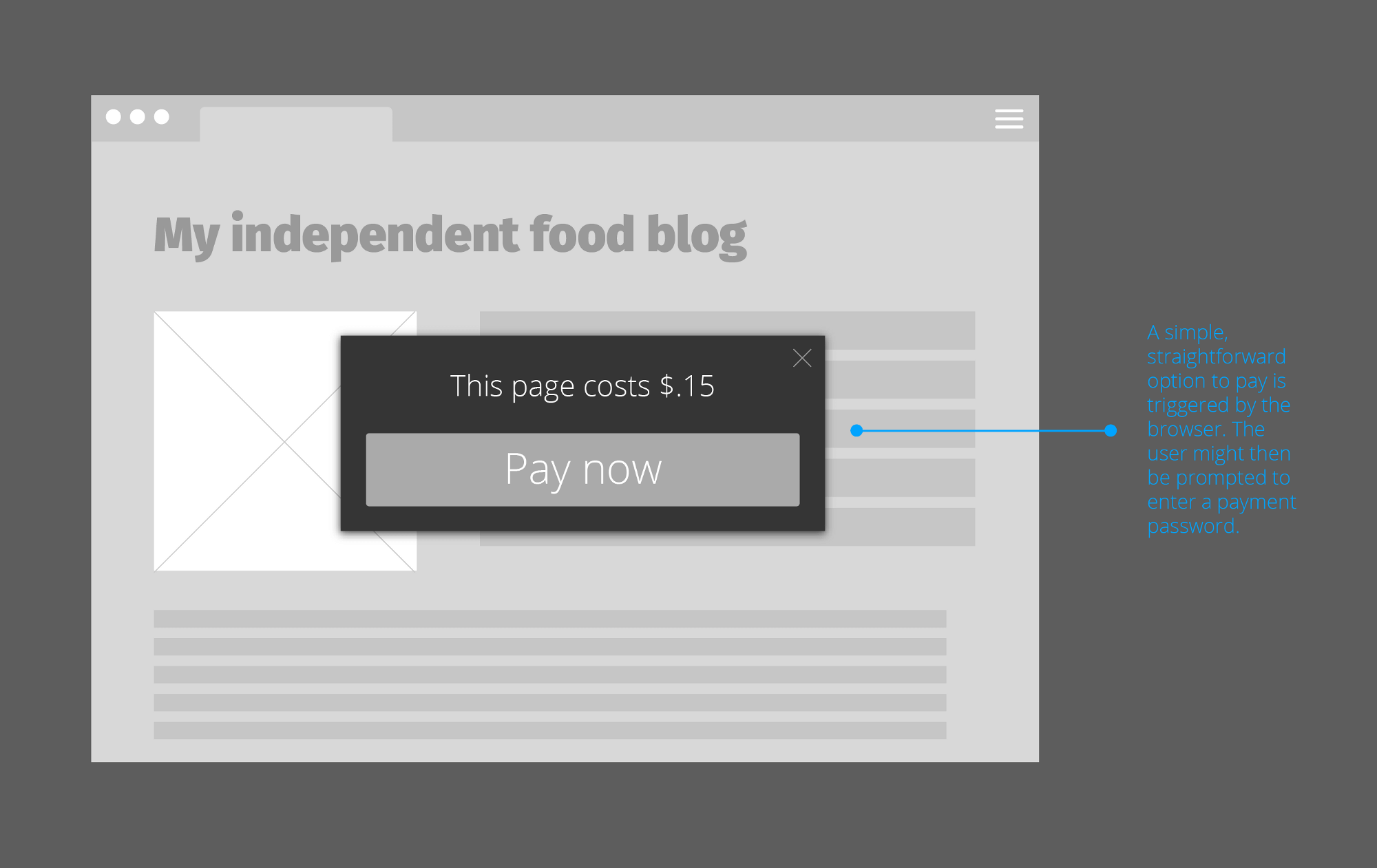
The biggest rough patch for me was his concept sketch for a blog post demanding a payment, which could probably use some re-thinking:
From the article: concept for price-setting at an “independent food blog”
This is exactly the kind of scenario I was trying to avoid when developing my own concept for web payments. For one thing, people don’t want a tin cup shaken in their faces every time they visit a daddy blog or a news article. For another, the real value of a pageview on an “independent food blog” is probably closer to $0.0015 than $0.15; direct web payments need to enable transactions at these kinds of price levels just as the ad market does for advertisers. Finally, payments should be voluntary (on the reader’s part) and price levels should be suggested. Ideally I’d be able to tell my browser to take a fixed dollar amount and divy it up between all the sites I visit every month based on visit frequency and suggested prices.
All things considered, though, I’m really glad more people are thinking along these lines. Spread the word.
Zen and the Art of Motorcycle Maintenance by Robert Pirsig
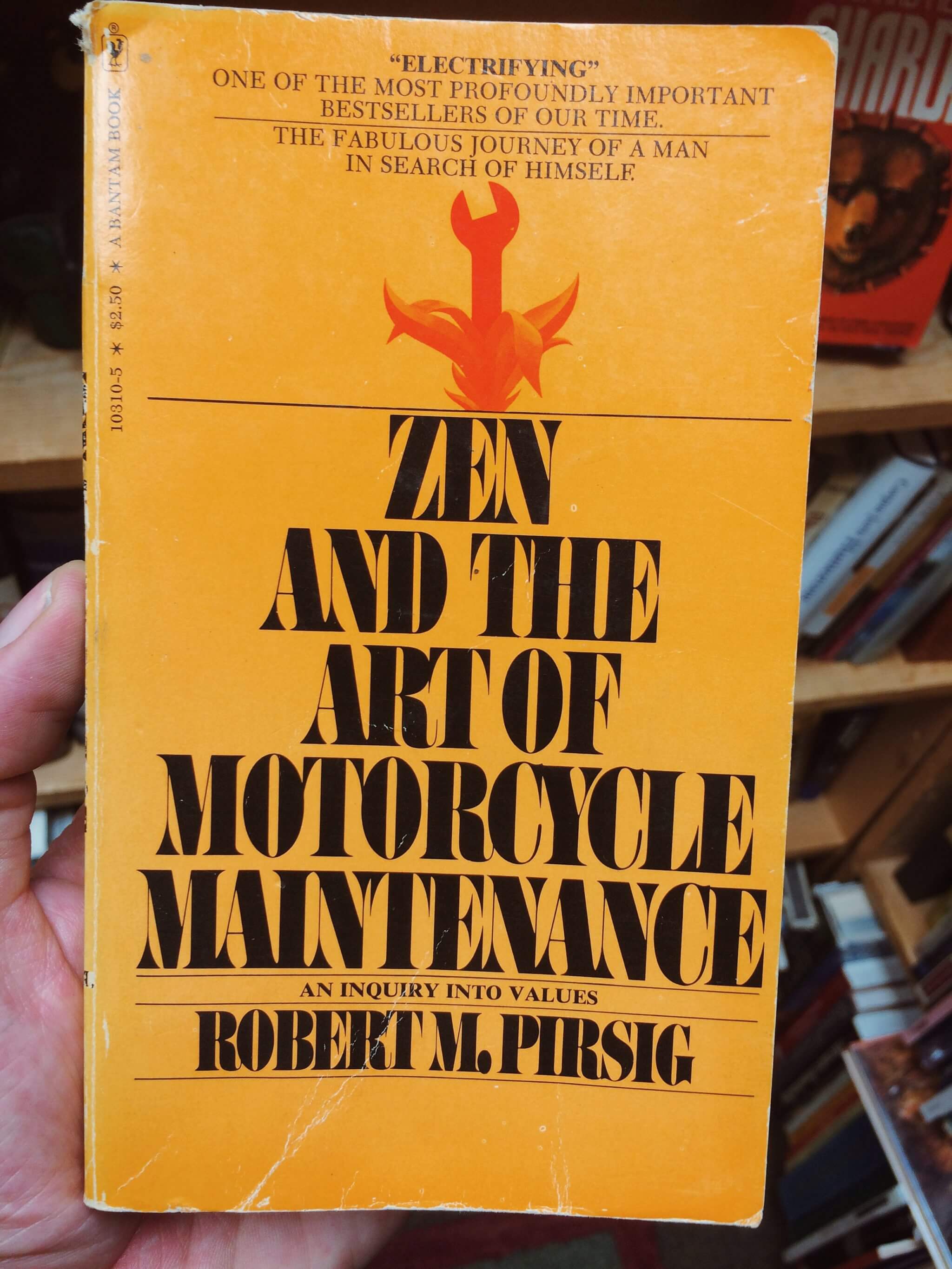
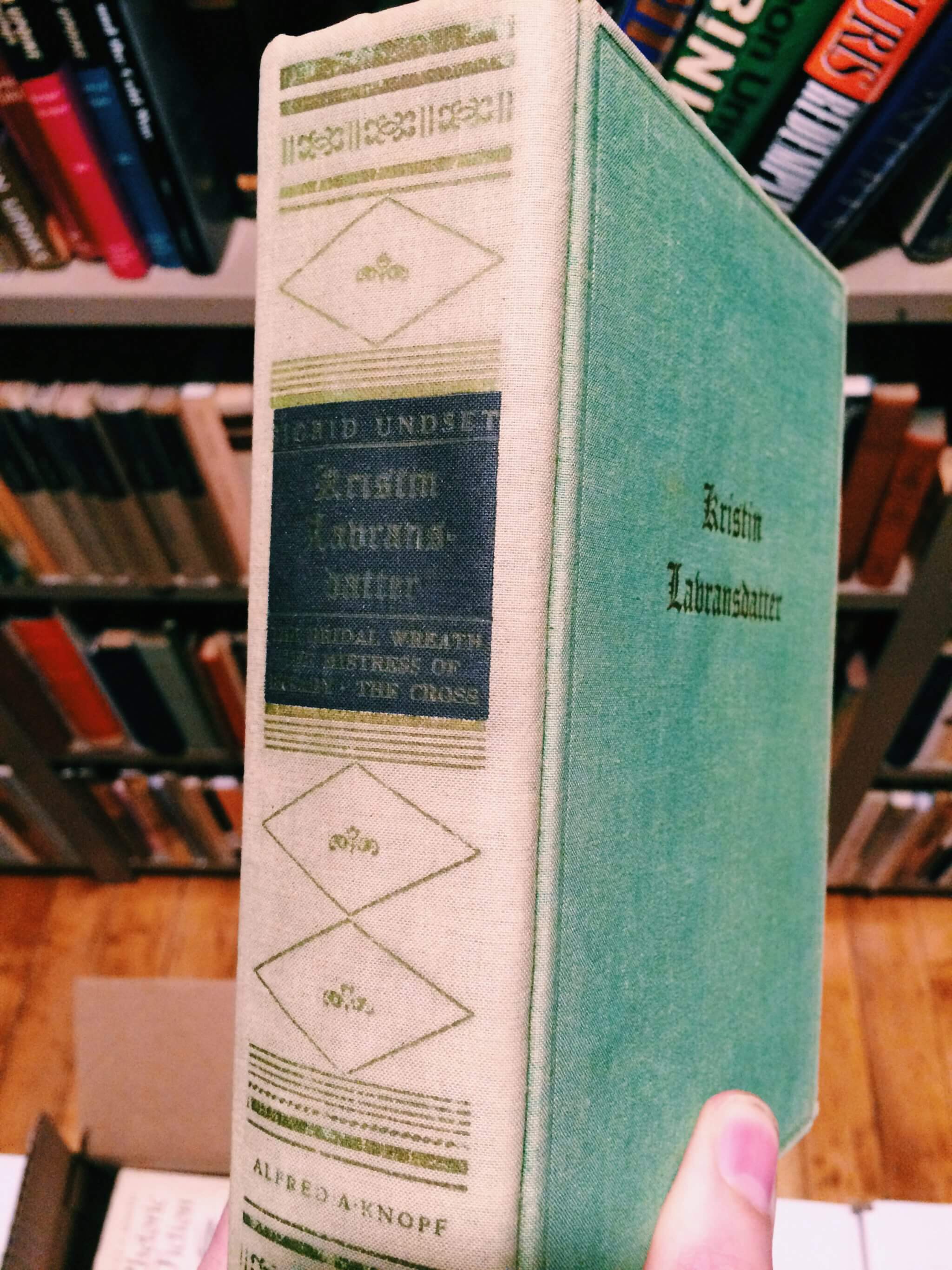
We stopped by The Book House last night where I thought I might find a Frost-approved translation of Kristin Lavransdatter (see previous note and no, they didn’t have one, and yes I checked and everyone else agrees with Matt about the translation thing). Instead I found Zen and the Art of Motorcycle Maintenance in the ‘new arrivals’ section. This will be my next lunch break book.
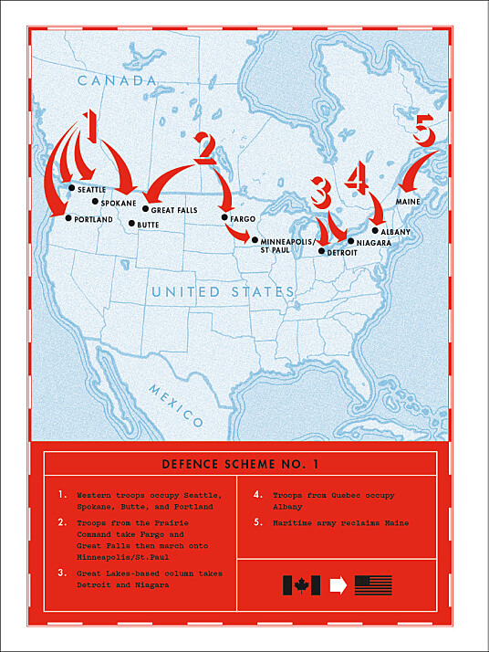
Apparently there was a brief period in the 1920s when America and Canada were both secretly drafting plans to invade each other. Tracy Mumford, reporting for Minnesota Public Radio:
In 1921, a Canadian lieutenant by the name of Buster Brown drafted “Defence Scheme No. 1.” Despite “defense” in the title, it was “a full-on invasion plan,” according to Kevin Lippert, the author of War Plan Red… In the end, he proposed a five-pronged attack. In the west, Canadian troops would take Seattle and Portland. In the east, the Quebecois would occupy Albany. Maine would be reclaimed, as would the Great Lakes. In the Midwest, Brown’s plan called for “Prairie Command” to swing through Fargo and then head south to invade Minneapolis and St. Paul.
“Defence Scheme No. 1” from War Plan Red By Kevin Lippert
What do you call a person who crafts paragraphs, stories and essays? Of course you call that person a writer. Our culture is familiar with this type of person and we have a handy label for them. Some people enjoy writing: these people are writers.
Now: what do you call a person who publishes or packages paragraphs, stories and essays?
Listen carefully. I’m not talking about an editor. I’m not talking about a book designer or a web designer. I’m talking about a person who enjoys the activity of packaging and producing words in the same way that the writer enjoys writing words. This person’s interest probably includes things like editing, book design, typography, web design — even writing! — but is not limited to any one of them.
We have no ready word for this person. My first instinct is to call them ‘publishers’. This doesn’t work very well, because it suggests a whole commercial concern, not an individual enthusiast, but I’ll stick with it for now.
I’d call myself a ‘publisher’ in this sense of ‘publishing enthusiast.’ For a time I thought of myself mostly as a writer because I like writing. But in an amateur way I got quite caught up in all these other things as well — coding and typography and podcasting — because writing by itself isn’t where the juice is for me. The juice for a ‘publisher’ is in the design of the whole system for packaging words, distributing them, presenting them. It’s the Screech principle applied not just to the writing, but to all the corners, surfaces and edges of the vehicle of writing: whatever I can learn or invent to make the word not just acceptable, but lovely — I do so. Or at least, it's what I do for kicks in my spare time.
We don’t talk about publishing-as-amateur-pursuit because we don’t have the words for it. We probably don’t have those words because it wasn’t feasible as an individual pursuit until recently (yay computers), and because its activity is usually blended with the activity of writing. But now that the tools are everywhere, the pursuit is there.
A writing enthusiast can hope to make it as a proper writer — to get some recognition for their work, to earn a living at it. But as a publishing enthusiast I don’t know what to do with my interests; there is no cultural or economic market for them. Publishers end up as inveterate yak shavers and one-man bands performing in their own driveways. Our ingrained preference to control all levels of design, and the facility which computers give us for doing so, tend to preclude us from cross-pollinating and collaborating, which for most of us is a big developmental hazard.
I tweeted earlier today that this is probably the best web/writing news of the summer, if not the year. Yes, that’s subjective. But anyhow, let me explain why I think it’s great.
For at least a few years now I’ve been trying to figure out how a good way to generate a web site and a print-ready PDF book from the same source document (because reasons). Before Pollen, the best route seemed to be: write the documents in Markdown, and then use a tool like Pandoc to convert that source to HTML and to PDF (via LaTeX).
The biggest problem is that Markdown is not actually great as a source format. Yes, it’s readable. Markdown documents, being plain text, can have a good shelf life. But in practice it’s just not very smart, and no one agrees on how to educate it. For example, suppose you want to specify a class for an image, so that it floats right. Markdown doesn’t provide a way to do this. Some variants of it have added support for it, but no one agrees on what syntax should be used. Whatever variant you pick, you better hope that your whole toolchain supports it (in the future as well as now). Just about every editor and processor and previewer out there supports their own 92% of what you need from Markdown and they each pick a different 8% to leave out. As an author, you really have no facility for doing things the way you’d like. Brett Terpstra has some good advice for coping with this, but it basically boils down to “keep your source documents as simple as possible to avoid running afoul of incompatibilities.” I say boo to that.
To use a graphics analogy, using Markdown as a source format for web and print is like creating art as a GIF and then trying to upscale to SVG.
Pollen offers a completely different way of doing things:
You decide what kind of semantics your documents need.
You design the markup your documents will use.
You decide exactly what output that markup produces.
Here’s an example excerpt of one of my documents in Pollen:
#lang pollen

◊(define-meta title "Two Voices in a Meadow")
◊(define-meta doc-publish-date "25/08/2015")
◊(define-meta author "Richard Wilbur")

◊margin-note{
In ◊hyperlink["http://www.english.illinois.edu/maps/poets/s_z/wilbur/
imageinterview.htm"]{an interview}, he said "the milkweed's speech is
indeed written in one of my voices and was used for the sister's funeral in
a genuine and appropriate way. But the other voice --- the 'slob' voice of
the stone, is also one of my voices."
}

◊verse{◊poem-heading{A Milkweed}
Anonymous as cherubs
Over the crib of God,
White seeds are floating
Out of my burst pod.
What power had I
Before I learned to yield?
Shatter me, great wind:
I shall possess the field.}
The ◊tags above are all functions I write. The ◊verse tag is a good example of an advantage of Pollen over Markdown, because Markdown has no facility for typesetting poetry (at least, none for setting it differently than source code). For now I’ve defined my ◊verse tag to place its contents inside a <pre class="verse"> tag which I can style with CSS. Someday I might find or need a different way to structure poetry in HTML; if so, I can simply edit the function and regenerate the site, likely without having to change the source documents at all. Another good example is YouTube embeds. I could create a ◊video tag that would take a YouTube ID and use their latest embed code. When YouTube changes I can update my code to match, the tag remains the same.
Pollen was compelling enough when HTML output was all it did. But as of today, you can specify multiple targets for your documents, and code the output behaviour for each. This means I could take a bunch of files like the one above and generate a web page, and a book-ready PDF, and a plain-text (dumbed down) Markdown version. If my requirements for any one of those target formats should ever change, I simply edit my Pollen code. The document itself can remain unchanged.
There are other things you could do, too. With some programming and some text-to-speech facilities, you could include .mp3 files as a target, and auto-generate an RSS feed, thus making everything you publish in written form into an automatic podcast as well.
With Pollen I finally have a tool I can use to publish to multiple formats where I have complete control over both the source markup and the finished result. Of course, you have to learn LISP programming to make full use of it, which is kind of daunting, but I’m having fun doing so.
When I was podcasting, one of the design choices I pondered was the time in an episode devoted to what I called front-matter and back-matter — the times before and after the episode main subject, where what’s being conveyed is no longer the show but is rather about the show: thanking the contributors, sponsor reads, giving out website address and social media handles, etc.
The podcasts I enjoy and respect most are very disciplined about their use of front- and back-matter (the former especially). Not coincidentally, the producers of these shows often (though not always) come from a broadcast radio environment, where every second is precious.
One of our go-to podcasts, 99% Invisible, began as a radio segment. Recently I found myself noticing that the “back-matter” portion of the podcast seemed to be getting longer…and longer…and longer. I found myself wondering whether this impression had any basis in reality or if it was just me.
Being a nerd, I ploughed through every episode of the show and noted its length, as well as the time devoted to “extra” matter at the front or back of each.
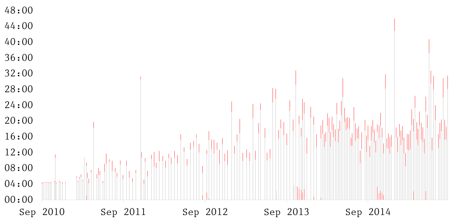
Figure 1: 99% Invisible episodes
So here’s every1 episode of 99% Invisible, showing its length and release date. The front- or back-matter of each episode is highlighted in red. Roman’s consistency as a producer makes this kind of analysis much easier than it would be with other shows: you can always start the “content clock” as soon as Roman Mars gives his signature opener, “This is 99% Invisible: I’m Roman Mars”, and stop it right when he starts to say “99% Invisible was produced this week by…”.
You can see the first dozen or so episodes are in that very tight broadcast radio segment format — almost exactly four minutes long with mere seconds of backmatter at the end — then the show begins to breathe a little. The annual Kickstarter campaigns of the last three years show up where there is noticeable front-matter in four or five episodes in a row, when Roman takes a couple minutes to talk about the campaign’s progress. You can also see the visible increase in frequency after the show went to weekly episodes in 2014.
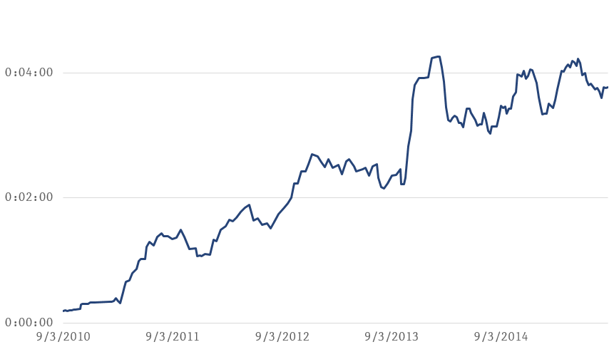
So is the “extra matter” really getting longer? It does seem like it on that first graph; but to better visualize it, I took each episode and calculated ten-episode rolling average of the extra-matter:
Figure 2: Ten-episode rolling average of extra matter length
There’s a clear upward trend here, which confirms my impression: when I started listening in 2012, the rolling average was under two minutes, and now it’s nearly four.
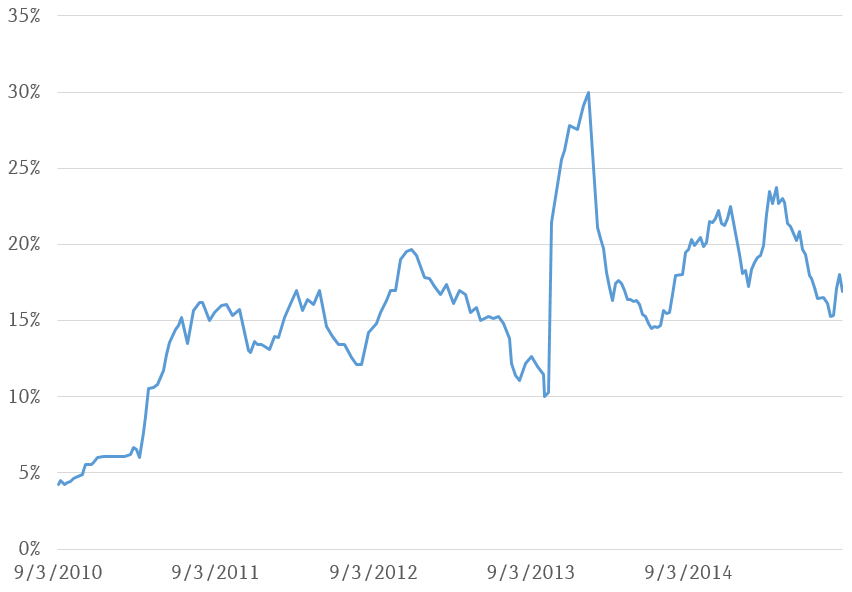
Of course, we also ought to look at the time as a percentage of total episode length:
Figure 3: Ten-episode rolling average of extra matter % of episode length
There is an upward trend here too, but it isn’t as dramatic. This seems mainly due to the fact that the average total episode length has also increased.
This exercise confirmed my suspicions about one podcast in particular, and raised further thoughts about podcasting in general.
As regards 99% Invisible, it’s clear that more and more time is being devoted to things other than strictly content. In the case of this particular podcast, the increase is mainly an indicator of the show’s growing ability to attract funding. If you’ve listened to the show you know that longer extra-matter time is almost entirely due to Kickstarter campaigns, sponsorship reads and network cross-promotions.
And that’s all these particular graphs clearly illustrate, as far as I can tell.
I very emphatically do not think these graphs tell a story of declining quality. On the contrary, I'd say they depict a remarkably effective and disciplined use of episode time, precisely because it correlates so closely with the show’s ability to fund quality content. That first graph above is really quite a solid benchmark of reliability and consistency, a record I’d be proud to have. You can see that even with the growing sponsorships and other factors, Roman still almost never adds any front-matter, and tightens up the back-matter wherever possible from episode to episode, demonstrating that even though he’s not on a broadcast clock, he still has a specific purpose in mind for that time and spends it with care.
To properly illustrate that story, however, we would really need to do the same graphs for several other podcasts and lay them out next to 99% Invisible. On many other podcasts I’ve heard, the hosts will happily lay on large dollops and thick slices of time talking about the show or about themselves before they get down to the topic at hand. This extra time can vary wildly from episode to episode, has zero connection to the show’s ability to self-fund its own production, and as such it usually feels (to me) gratuitous. I suspect that graphing out many other shows, especially “pals shooting the breeze” podcasts and those where the producer does not come from a radio background, would reveal a much more chaotic and undisciplined use of extra-matter; but alas, it’s too big of a project for me right now.
As I mentioned at the beginning, the amount of time devoted to extra-matter is a design choice. A purist approach would be to eliminate all of it, so that everything the listener hears is juicy content, specific to that one episode. I took this approach early on; I still find it hugely refreshing whenever I find it in other shows, just because it’s so rare, and signals real thoughtfulness about the craft. But as a listener, I also find the familiar names, reminders and slogans that come with well-written extra-matter have their own kind of pleasure. They build (for me, at least) a sense of connection to the host; in cases of well-produced storytelling, they also bring me “up and out” of my individual experience of the show and remind me that there’s a community of other listeners, and online venues where we can congregate if we wish to do so.
Clearly there’s an upper range of extra-matter (length and percentage) that most listeners will tolerate before they start to notice. 99% Invisible is definitely getting close to that limit, but it’s actually a good place to be: a sweet spot at the top of a curve where funding is maximized, just before commercial concerns start to really bring down quality of experience. (Now I’m referring to a completely imaginary graph, sorry.) I think other podcasters should really study their example in this area.
I should note I eliminated one episode from this analysis, episode #127. This episode was primarily a “rebroadcast” of a segment produced for BBC in 2011, and at over an hour long it dwarfed all the other episodes when added to the graph. I've placed the raw data for the charts (but including episode 127) in this Google docs spreadsheet.↩