



In January of 2011, our wedding was approaching, and I took on the project of letterpress-printing our invitations.
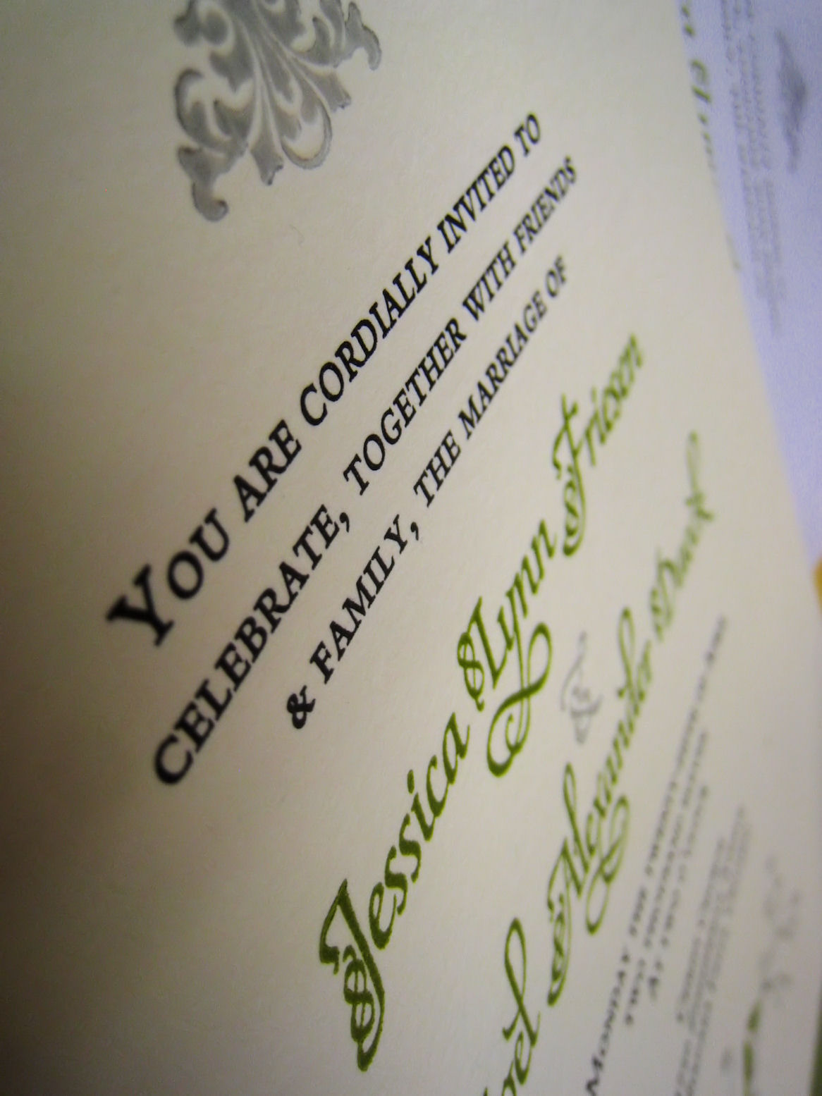
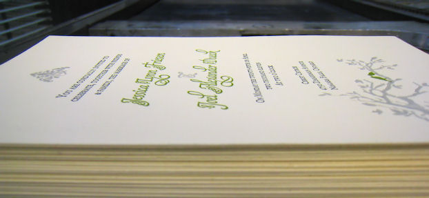
I printed exactly one hundred invitations on Crane Lettra paper, using a Vandercook letterpress and rubber-based inks, over a period of three weeks.
The typefaces used were a mix of old and new. The main text is set in Monotype Bembo, a 1929 revival of a face cut in 1495 by Aldus Manutius in Venice. Our names were set in Maestro, a recent typeface design by Philip Bouwsma of Canada Type in Toronto, whose characters are modeled after the work of Arrighi and the Italian chancery cursive of the early sixteenth century.

Comments are closed.