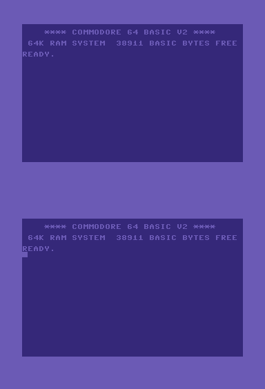
The cursor in a text entry field is something that usually hides in plain sight. There it is, cuing you as to where your next keystroke is going to appear on the screen; the classiest of servants, it never draws attention to itself. You stare at it all the time and probably never notice it.
These days, no matter what computing platform you’re on, your text cursor is likely to be a thin line, almost hairline-width. But years ago they were chunky blocks of pixels, taking up a full character width 


Why were cursors originally drawn this way? One assumes that the machine code for drawing a block was simpler on text terminals, since you could treat the cursor as just another character. It may have been a design decision too, since a block would be more visible on a monochrome, low-resolution screen.
I’m just as curious about why cursors thinned with the emergence of graphical interfaces. Interface design is like clothing design, it consists of fashions and styles that emerge and replicate across the whole field before you can even tell where they began; but someone had to have thought about it to begin with, and I wonder who that person was and how they ended up starting that trend.
There’s something understated and elegant about a thin cursor — again, the servant metaphor I mentioned explains it best: a white-gloved butler always there when you need him, doing his job with economy of style and invisible at all other times.
I miss the block cursor, though. I would like to see it reappear in more places, to have the option for it. A block cursor is less like a butler and more like an opinionated pal who comes to hang out in your studio.

Further notes to this article will collect pictures of block cursors from various platforms, quotes from sources knowledgeable on the history of text cursor design, instances of block cursors being incorporated on new platforms, and anything else relevant to the topic.


If your display device happens to be “hundreds of people opening and closing umbrellas, viewed from high altitude” (low resolution + greater need to reuse screen space by overwriting previous characters) then of course blinking block cursors offer the best clarity.
— Joel (Author) ·
I love the thicker bright blue cursor in the Ulysses app:
This style is standard on iOS, where small screens necessitate a more visible cursor. I hope this someday becomes a system-wide option on OS X.
The above screenshot is taken from my rough review of Ulysses.
— Joel (Author) ·
The “Blinking Text Cursor for CRT Display” was first patented in 1967 by Sperry Rand Corp:
(hat tip: Track Changes newsletter)
— Joel (Author) ·