Letterpress
We’re fortunate to live near the Minnesota Center for Book Arts, where I’ve taken letterpress printing courses, and worked on my own projects from time to time.
Wedding Invitations
In January of 2011, our wedding was approaching, and I took on the project of letterpress-printing our invitations.
I printed exactly one hundred invitations on Crane Lettra paper, using a Vandercook letterpress and rubber-based inks, over a period of three weeks.
The typefaces used were a mix of old and new. The main text is set in Monotype Bembo, a 1929 revival of a face cut in 1495 by Aldus Manutius in Venice. Our names were set in Maestro, a recent typeface design by Philip Bouwsma of Canada Type in Toronto, whose characters are modeled after the work of Arrighi and the Italian chancery cursive of the early sixteenth century.

One Take Only
I had an opportunity of doing a letterpress workshop at the Minnesota Center for Book Arts again on Tuesday.
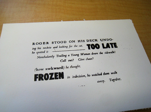
I had only three hours to set the type, buy paper, do my printing and clean up, so I thought I would aim low by setting up one of my marquee fiction pieces, a series of short fictional vignettes each exactly 256 characters long (so they could fit in the Windows “Marquee” screensaver). Next time I am so limited for time, I will just do a business card.
As it was, with a three-hour limit, I was scrambling to get the type set and by the time I was (barely) ready to print, I had only an hour left. I bought and cut my paper, snatched some chocolate brown ink out of the cupboard, locked the chaise into the press, and slapped my paper in without really aligning it except by eye, and started printing. I think the attendant was a little appalled by all the details I seemingly cared little or nothing for, but I was in too much of a hurry to sit down and talk it over with her.
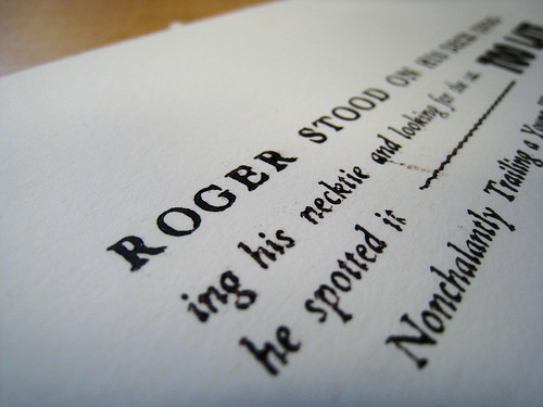
I was especially fortunate that I had no bad letters and no typos. As you can see, it has a kind of hurried, authentic quality to it (putting it charitably). I’m thinking of another run, more carefully prepared, but only if I can sell them, since it would cost me more to rent time on the press. As it is I may end up just putting all the pieces away and make this an extremely limited edition.

Good Night Irene, Scene Four, set in 18pt Goudy Roman, 16/18pt Bembo Italic, and 36pt “Unidentified” type, printed on Crane Lettra 300gsm paper
Art is Long
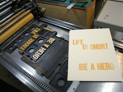
I just finished a Letterpress course at the Minnesota Center for Book Arts, and enjoyed it very much. It would have been better if I hadn’t been sent out of town on business for the last two weeks of it but I was able to catch up to some extent.


