


When I was podcasting, one of the design choices I pondered was the time in an episode devoted to what I called front-matter and back-matter — the times before and after the episode main subject, where what’s being conveyed is no longer the show but is rather about the show: thanking the contributors, sponsor reads, giving out website address and social media handles, etc.
The podcasts I enjoy and respect most are very disciplined about their use of front- and back-matter (the former especially). Not coincidentally, the producers of these shows often (though not always) come from a broadcast radio environment, where every second is precious.
One of our go-to podcasts, 99% Invisible, began as a radio segment. Recently I found myself noticing that the “back-matter” portion of the podcast seemed to be getting longer…and longer…and longer. I found myself wondering whether this impression had any basis in reality or if it was just me.
Being a nerd, I ploughed through every episode of the show and noted its length, as well as the time devoted to “extra” matter at the front or back of each.
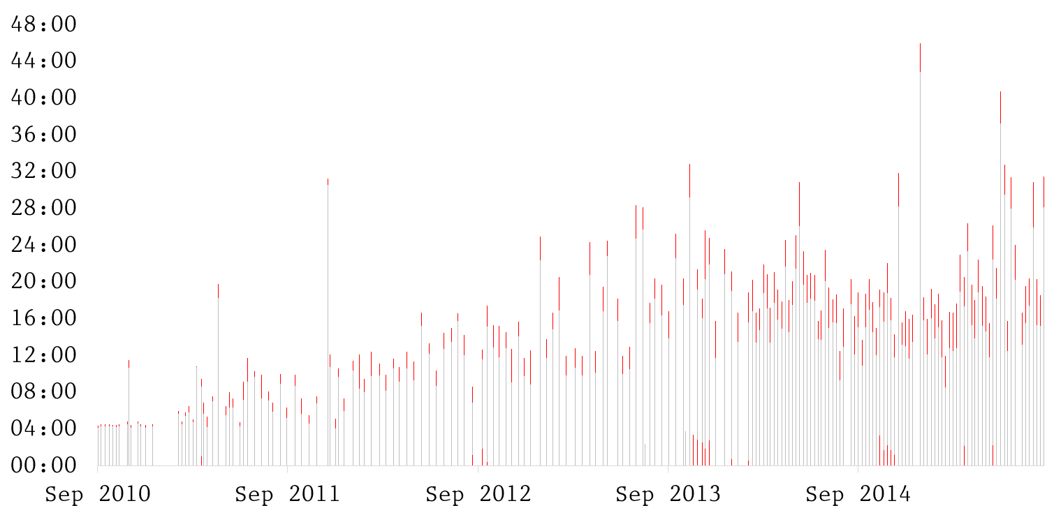
So here’s every1 episode of 99% Invisible, showing its length and release date. The front- or back-matter of each episode is highlighted in red. Roman’s consistency as a producer makes this kind of analysis much easier than it would be with other shows: you can always start the “content clock” as soon as Roman Mars gives his signature opener, “This is 99% Invisible: I’m Roman Mars”, and stop it right when he starts to say “99% Invisible was produced this week by…”.
You can see the first dozen or so episodes are in that very tight broadcast radio segment format — almost exactly four minutes long with mere seconds of backmatter at the end — then the show begins to breathe a little. The annual Kickstarter campaigns of the last three years show up where there is noticeable front-matter in four or five episodes in a row, when Roman takes a couple minutes to talk about the campaign’s progress. You can also see the visible increase in frequency after the show went to weekly episodes in 2014.
So is the “extra matter” really getting longer? It does seem like it on that first graph; but to better visualize it, I took each episode and calculated ten-episode rolling average of the extra-matter:
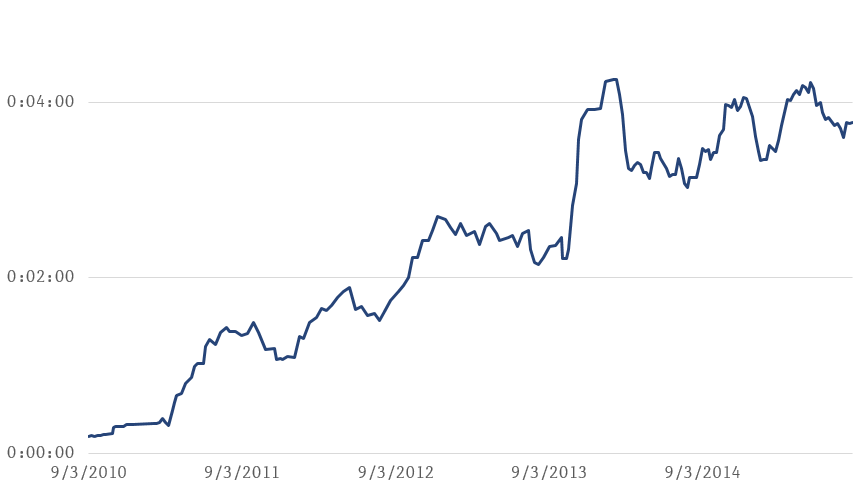
There’s a clear upward trend here, which confirms my impression: when I started listening in 2012, the rolling average was under two minutes, and now it’s nearly four.
Of course, we also ought to look at the time as a percentage of total episode length:
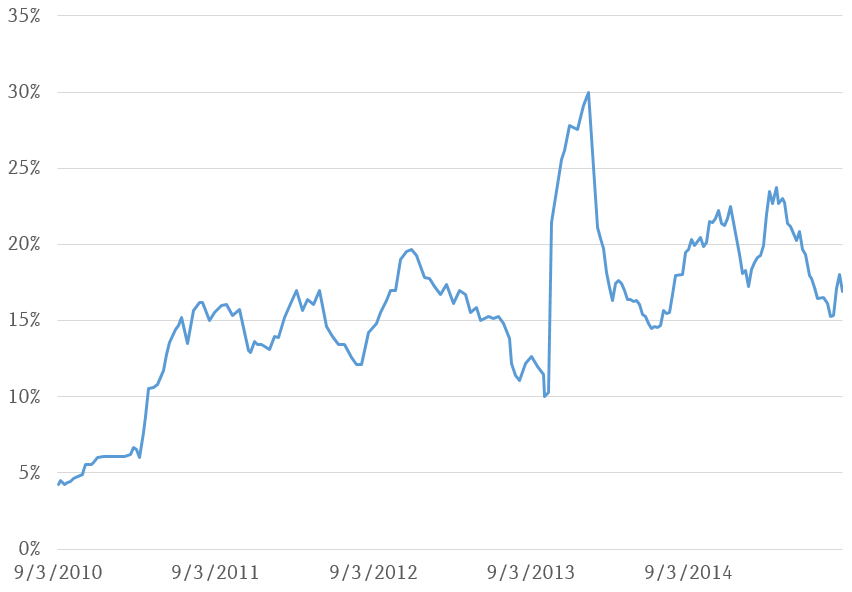
There is an upward trend here too, but it isn’t as dramatic. This seems mainly due to the fact that the average total episode length has also increased.
This exercise confirmed my suspicions about one podcast in particular, and raised further thoughts about podcasting in general.
As regards 99% Invisible, it’s clear that more and more time is being devoted to things other than strictly content. In the case of this particular podcast, the increase is mainly an indicator of the show’s growing ability to attract funding. If you’ve listened to the show you know that longer extra-matter time is almost entirely due to Kickstarter campaigns, sponsorship reads and network cross-promotions.
And that’s all these particular graphs clearly illustrate, as far as I can tell.
I very emphatically do not think these graphs tell a story of declining quality. On the contrary, I'd say they depict a remarkably effective and disciplined use of episode time, precisely because it correlates so closely with the show’s ability to fund quality content. That first graph above is really quite a solid benchmark of reliability and consistency, a record I’d be proud to have. You can see that even with the growing sponsorships and other factors, Roman still almost never adds any front-matter, and tightens up the back-matter wherever possible from episode to episode, demonstrating that even though he’s not on a broadcast clock, he still has a specific purpose in mind for that time and spends it with care.
To properly illustrate that story, however, we would really need to do the same graphs for several other podcasts and lay them out next to 99% Invisible. On many other podcasts I’ve heard, the hosts will happily lay on large dollops and thick slices of time talking about the show or about themselves before they get down to the topic at hand. This extra time can vary wildly from episode to episode, has zero connection to the show’s ability to self-fund its own production, and as such it usually feels (to me) gratuitous. I suspect that graphing out many other shows, especially “pals shooting the breeze” podcasts and those where the producer does not come from a radio background, would reveal a much more chaotic and undisciplined use of extra-matter; but alas, it’s too big of a project for me right now.
As I mentioned at the beginning, the amount of time devoted to extra-matter is a design choice. A purist approach would be to eliminate all of it, so that everything the listener hears is juicy content, specific to that one episode. I took this approach early on; I still find it hugely refreshing whenever I find it in other shows, just because it’s so rare, and signals real thoughtfulness about the craft. But as a listener, I also find the familiar names, reminders and slogans that come with well-written extra-matter have their own kind of pleasure. They build (for me, at least) a sense of connection to the host; in cases of well-produced storytelling, they also bring me “up and out” of my individual experience of the show and remind me that there’s a community of other listeners, and online venues where we can congregate if we wish to do so.
Clearly there’s an upper range of extra-matter (length and percentage) that most listeners will tolerate before they start to notice. 99% Invisible is definitely getting close to that limit, but it’s actually a good place to be: a sweet spot at the top of a curve where funding is maximized, just before commercial concerns start to really bring down quality of experience. (Now I’m referring to a completely imaginary graph, sorry.) I think other podcasters should really study their example in this area.
I should note I eliminated one episode from this analysis, episode #127. This episode was primarily a “rebroadcast” of a segment produced for BBC in 2011, and at over an hour long it dwarfed all the other episodes when added to the graph. I've placed the raw data for the charts (but including episode 127) in this Google docs spreadsheet.↩